Comparing Claude Fable & GPT 5.6 Sol in UI design
A practical, side-by-side look at how Claude Fable and GPT 5.6 Sol approach the same UI design brief.
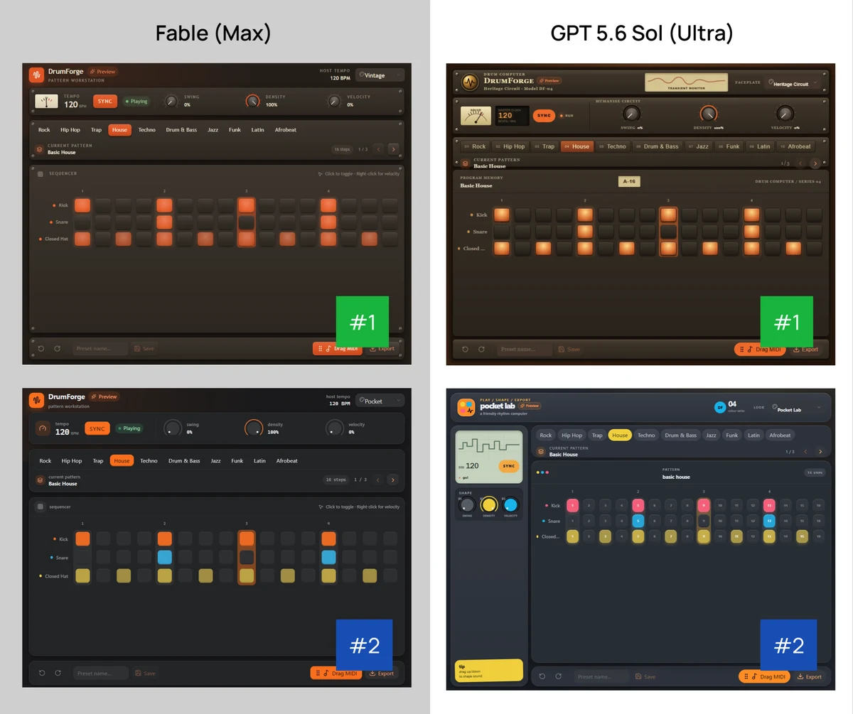
I decided to put Fable and GPT 5.6 Sol head-to-head on a design challenge.
The Challenge
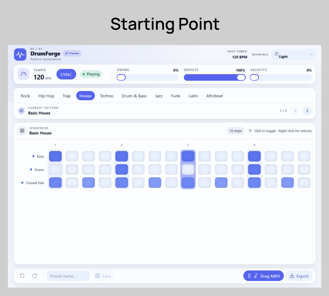
Both started with the same basic UI - the light themed drum machine I made earlier, and both were given the same prompt: come up with four unique designs.
- Vintage/classic console
- Fun/retro - Teenage Engineering vibes
- Their choice
- Their choice
They were told they had complete creative freedom to build and change whatever they wanted: create custom controls, UIs, SVGs, and more, or change the template completely if it better suited the theme.
The Concepts
For Fable’s third and fourth designs, it chose Blackout and Phosphor.
For Sol’s third and fourth designs, it chose Blacksite and Abyssal Bloom.
The Result
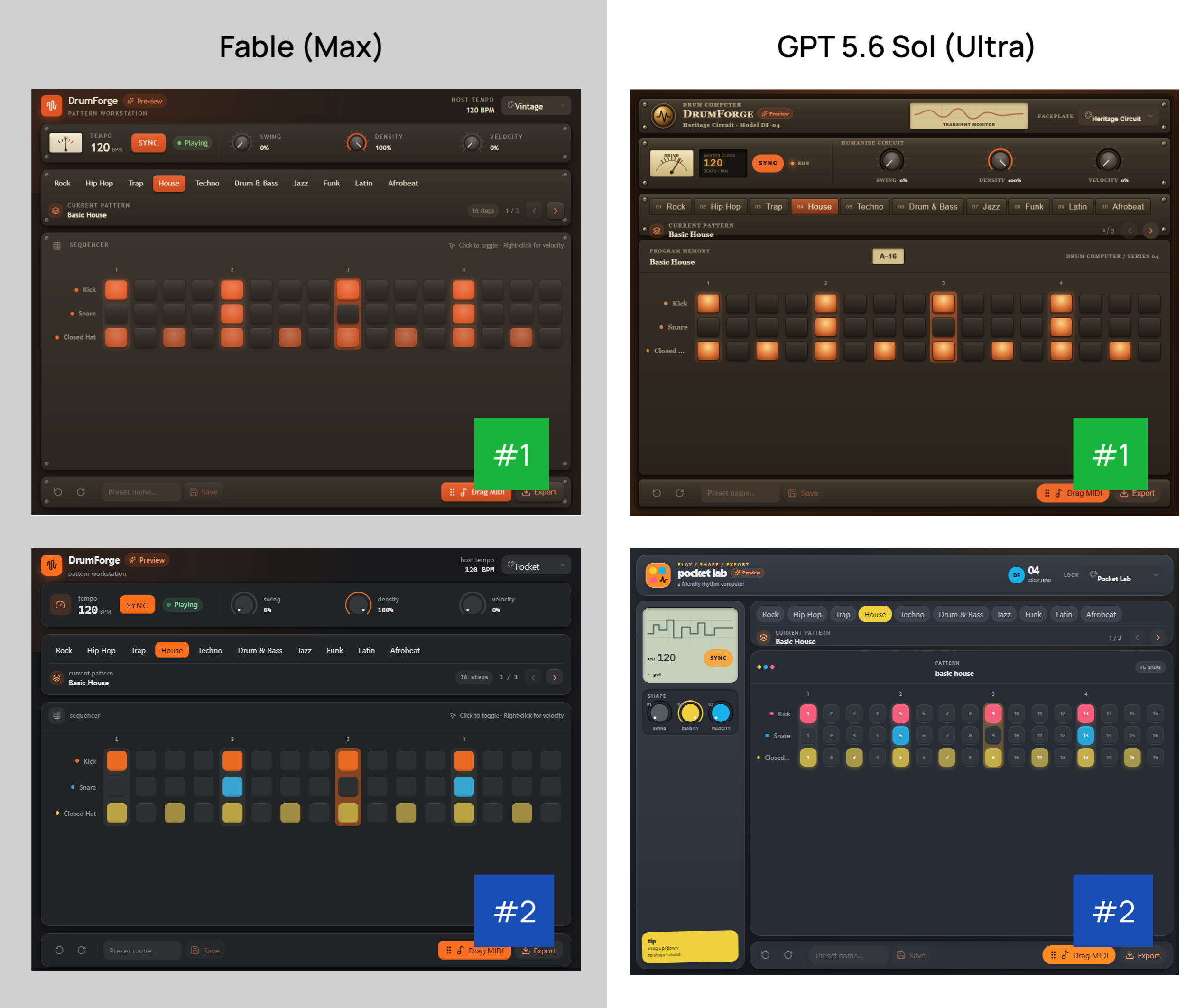
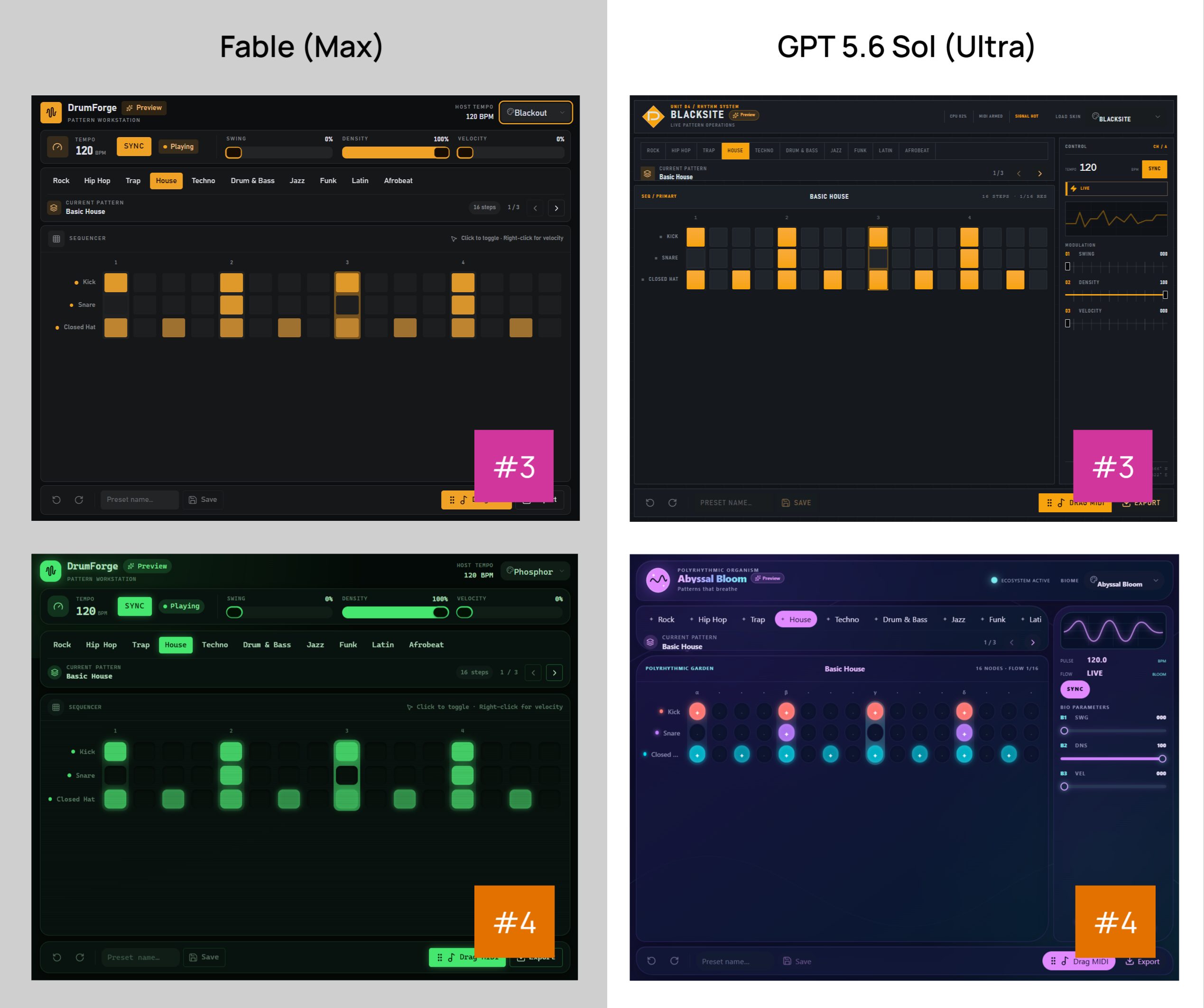
To be honest, I think both gave reasonably similar results - but in general, I preferred the polish of Fable across all the designs.
Sol was more willing to change the layout completely, which is good, but in the details you can see it doesn’t deliver - especially with design #2, the fun/retro option.
Creatively, I feel like they’re both at a similar level, but Sol falls short on the details: alignment, consistency, etc. You can see text spilling over containers or icons misaligned all over the place. Fable does a much better job of delivering a polished result.
Verdict: Fable Wins. - although neither of their designs really blew me away…